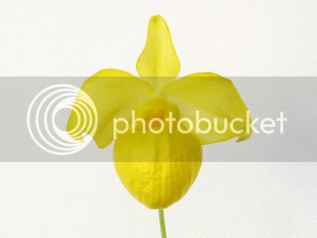
I disagree with the use of black backgrounds for concolor yellow or light green flowers. Black tends to create a contrast with these flowers that is just too strong for their color, and makes colors wash out when properly exposed. I do use black when I photograph white or near white flowers, because I feel that the lack of color or the specific tints of color present in a white flower is much more apparent on a black BG. Portrait spot lighting the BG may help with some of these issue, but most photographers don't have access to a smaller light (most don't even use off camera flash or other lighting).
I don't think that white is the right color BG either, also because contrast is difficult to achieve without proper front and profile lighting. Flowers always appear darker than they really are, white provides little edge detail in these concolor flowers.
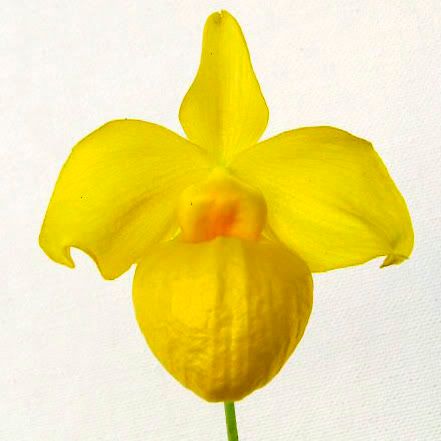
I prefer grey, medium/dark green, or medium blue for these flowers. Grey provides a good neutral shade, improving contrast and making color & detail easier to evaluate. Green is complimentary to the color yellow, showing it off well. Blue is also a great color, especially for light green/chartreuse flowers, for similar reasons. The color of your light becomes critical when shooting on colored backgrounds, however, as tinting of the light will always occur as light is reflected onto the flower. Without question, proper color exposure in-camera is much preferred.
It is important to choose a color that is slightly darker than the green or yellow flower being photographed, as contrast is very important for portraiture. The Zone System develped by Ansel Adams is a good place to start looking at degrees of contrast and shades of grey. It is a good idea to think in shades of grey when shooting color. A properly exposed photo isn't always the best photo depending on your intent, but knowing proper exposure is. For more info about the Zone system, check out Ansel Adams' Exposure.