I haven't used photoshop to edit my images in a long time; when I do the color and saturation seems to get too intense and out of whack but when I just use the canon photo pro software the colors look more natural. It shouldn't be that way, wish I knew why it happened..
It all depends on two things: 1) whether your monitor is calibrated and what it's calibrated to, and 2) how the software you use handles color. If I use photoshop to edit a photo and take it into another Adobe application, the color pretty much stays the same, now that Adobe has calibrated their software packages together. But if I take that photo into another program, like Word, it may look different, especially if I print it with Word as opposed to printing it in Photoshop or, for instance, Adobe Reader.
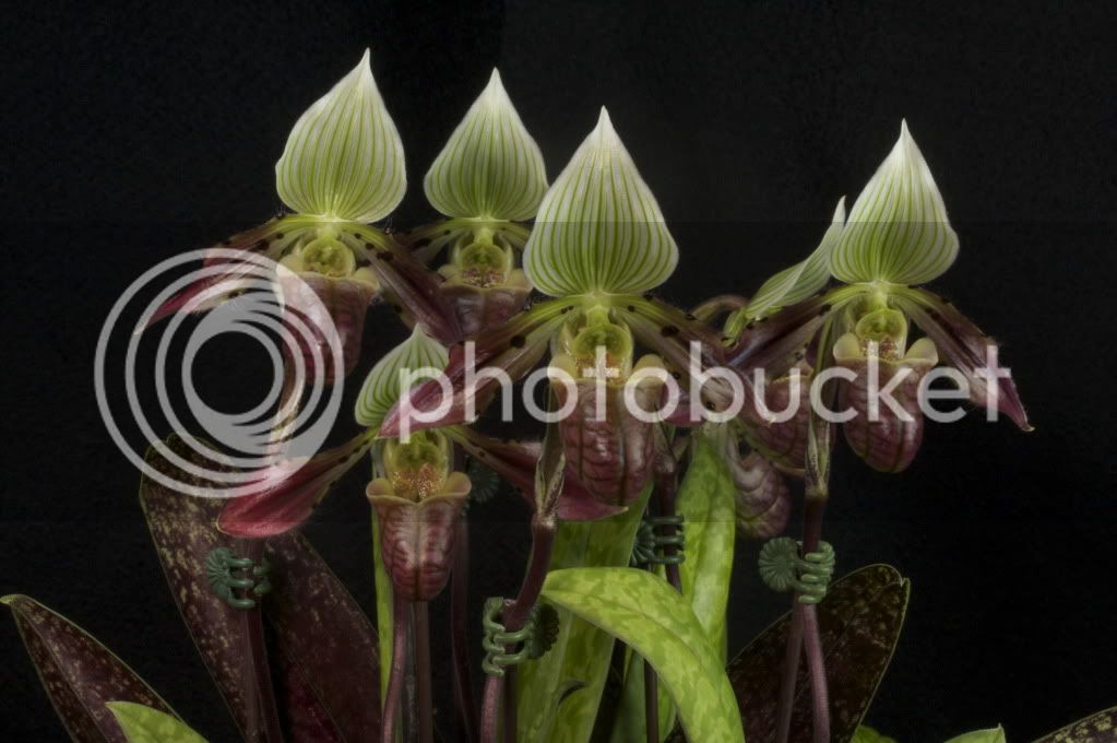
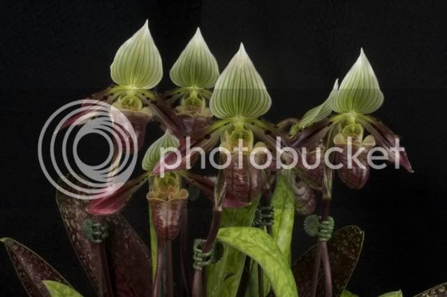
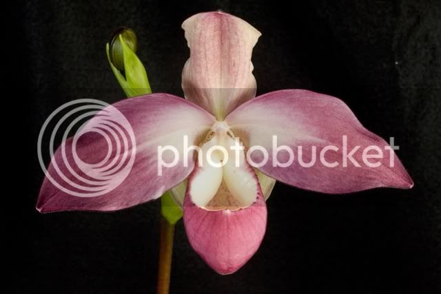
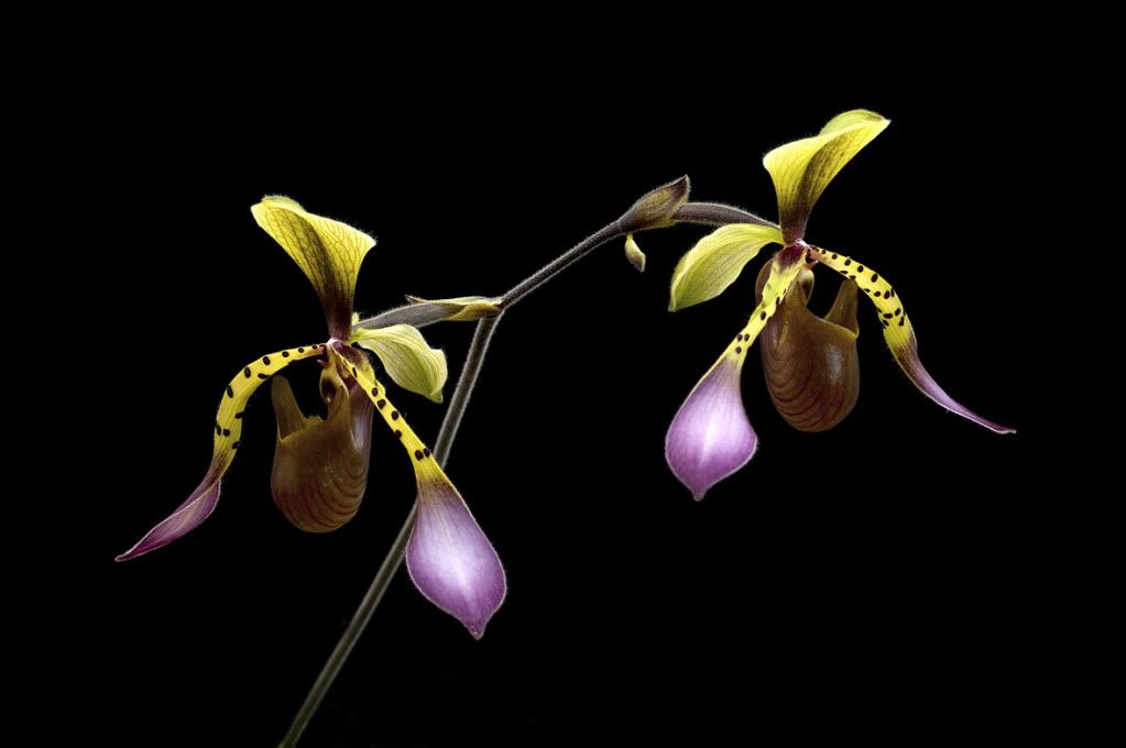
So Dot, the photos I see of yours here are wonderful. Are you happy with the image you see here of you photos? Can you run through the uploading process you use? I would appreciate it.
Thank you. I've actually only seen one of my photos that I thought was different after I posted it from Photobucket. I don't think I do anything out of the ordinary. After editing the photo in Photoshop, I save it as a Photoshop file on my computer. Then I resize it, for posting here typically between 1.40 - 1.60 Mb. Then I use the "Save for Web & Devices command under "Save", pick .jpg as the file format and 40% for the compression level. I save that to my computer, also. Then I go to Photobucket and upload it, already sized and saved as a JPEG. That way, Photobucket doesn't do anything to the file, except store it.
Just a note: I very very rarely save the original file as a JPEG only. JPEG is a "lossey" file format, meaning the more you compress it, the more information is lost forever. That format uses algorithms to "bring back" the information lost by compression, but that means it is just averaging pixels to make it look OK. The information that is lost in compression is just plain gone. And NEVER save a jpeg over a saved jpeg because every time you save a jpeg over jpeg, more information is lost. Photoshop, on the other hand, does compress, but does not lose information. It's called lossless compression.
Hope that helps.